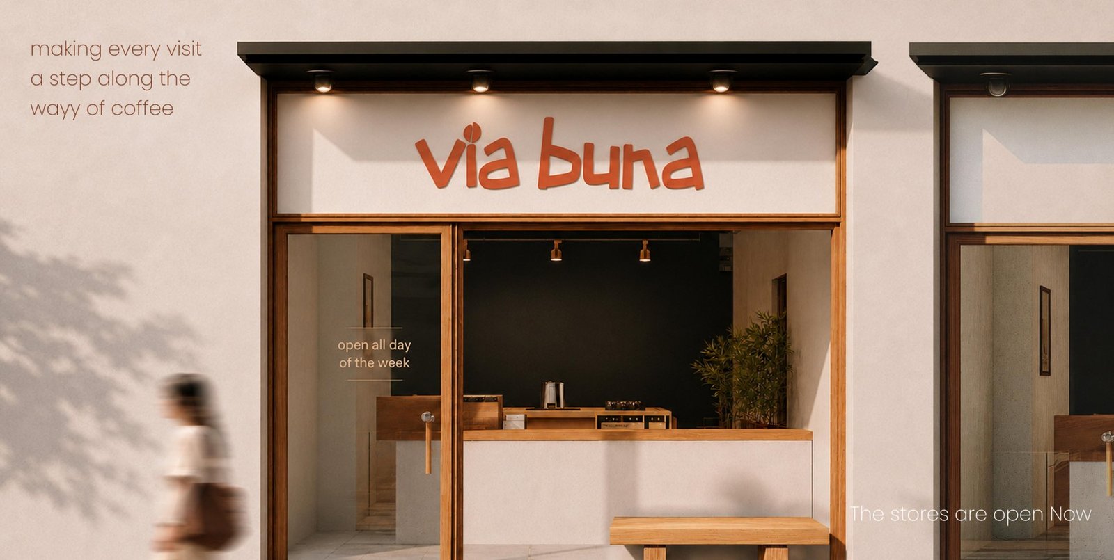
Case Study
Via Buna
Logo, brand identity, packaging, UI/UX, and website design for an Ethiopian-rooted specialty coffee brand.
Logo, brand identity, packaging, UI/UX, and website design for an Ethiopian-rooted specialty coffee brand.
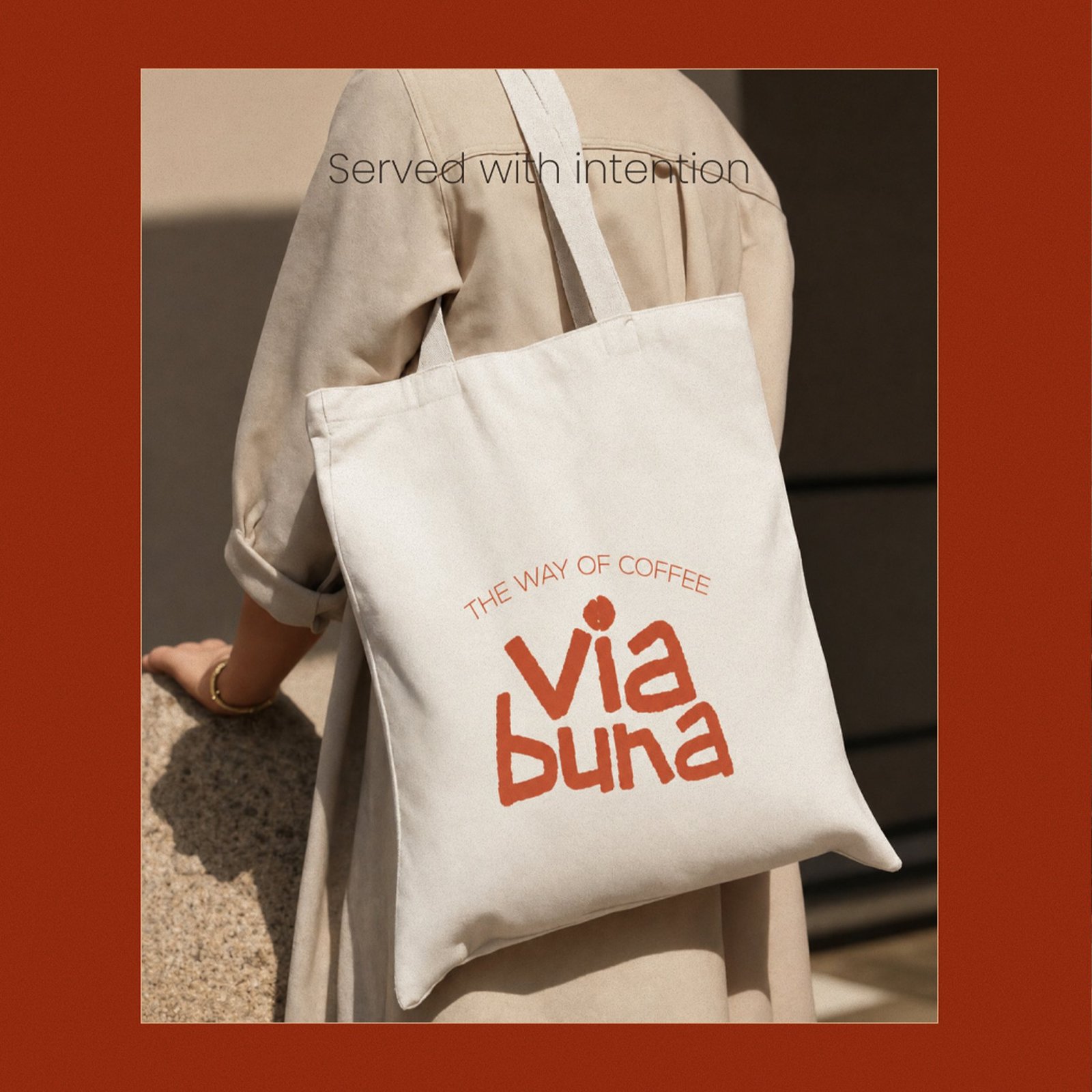
Via Buna wanted an identity that skipped the generic third-wave coffee shop look — something warmer, rooted in the Ethiopian origins of coffee itself. The name combines "Via," Latin for journey, with "Buna," the Ethiopian word for coffee: together, the way of coffee.
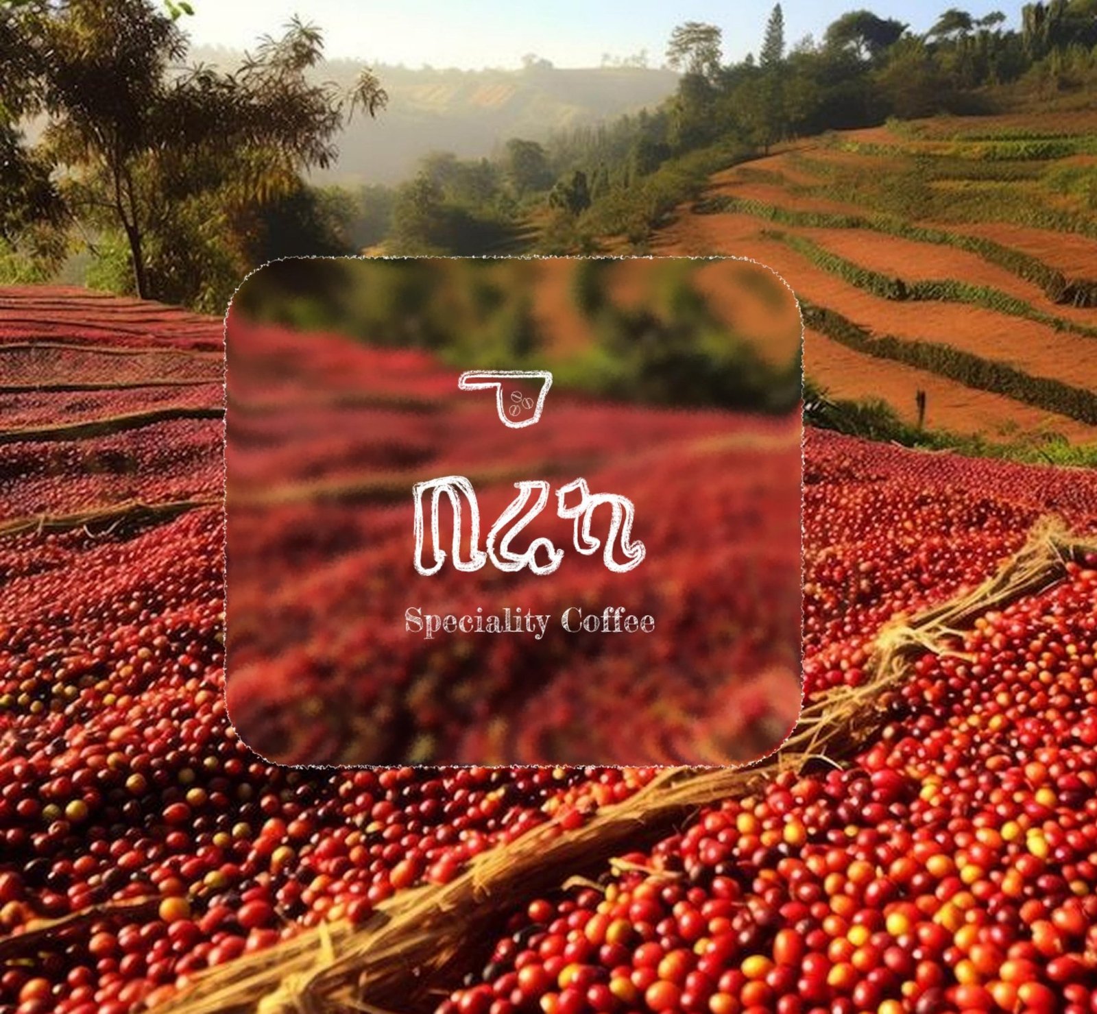
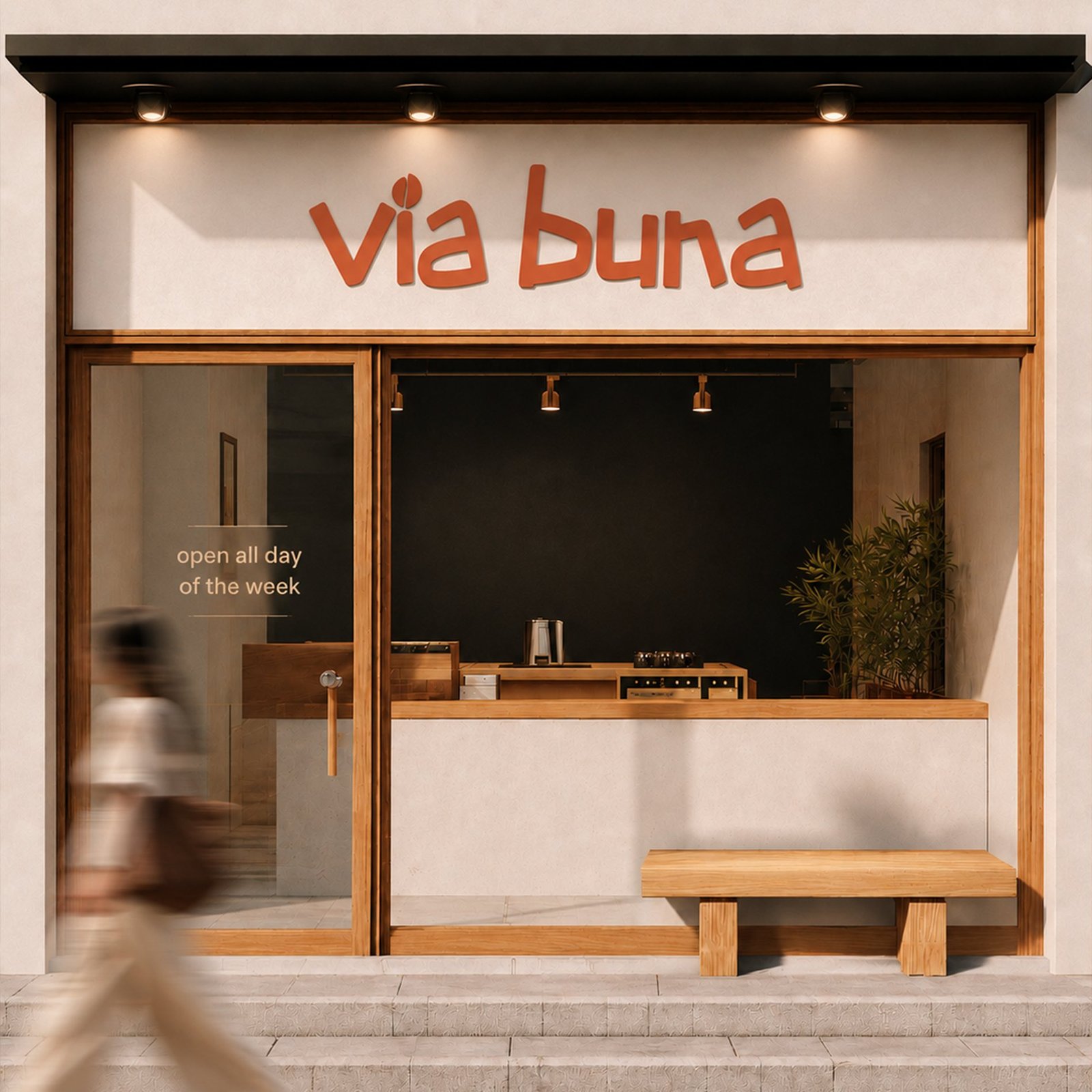
The name Via Buna combines "Via," the Latin word for the journey, with "Buna," the Ethiopian word for coffee — together, the way of coffee. Inspired by coffee's origins in Ethiopia, the brand celebrates every step of the experience, from sourcing and roasting to brewing and sharing, extended seamlessly across packaging, merchandise, and the café itself.
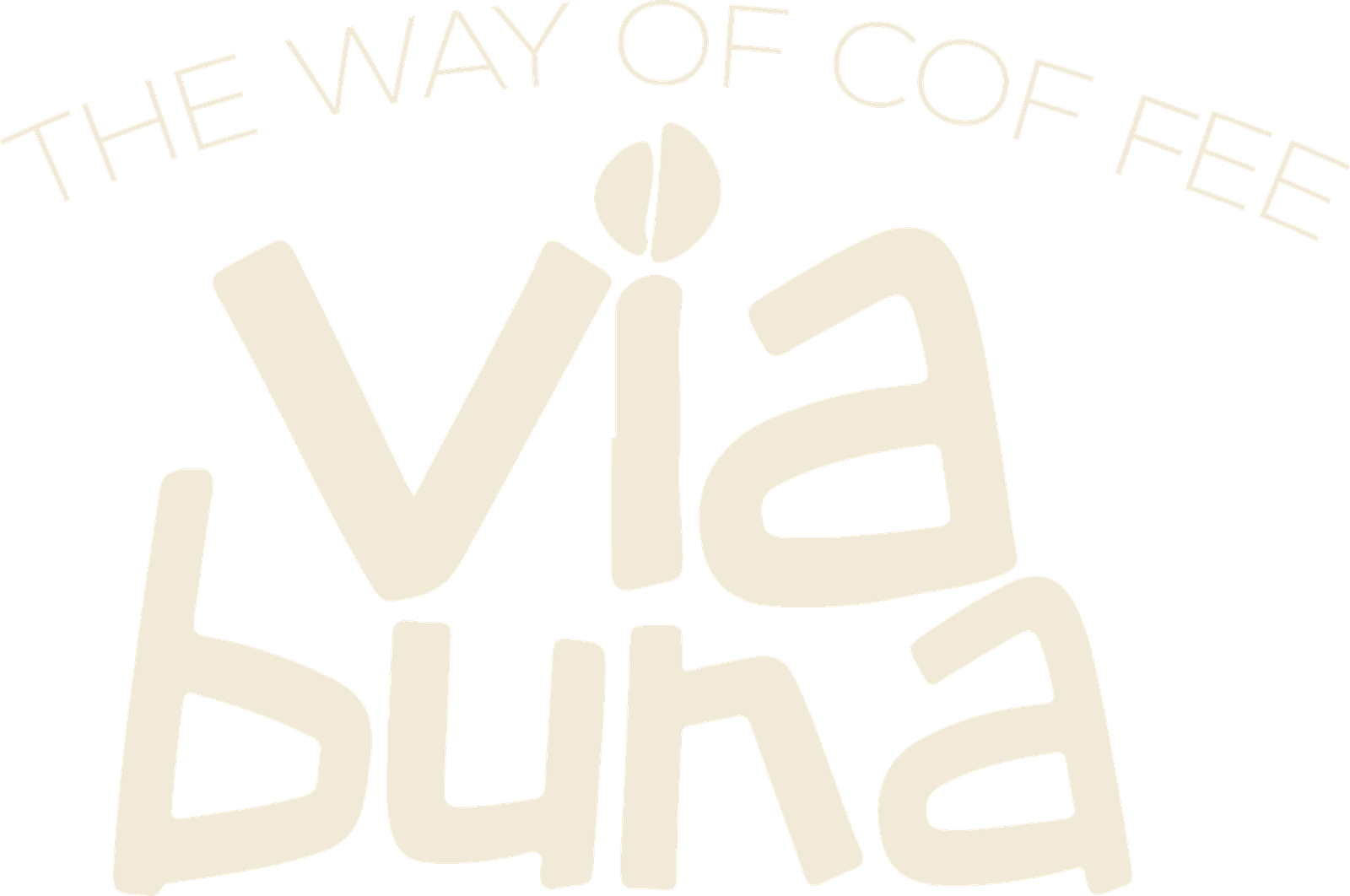
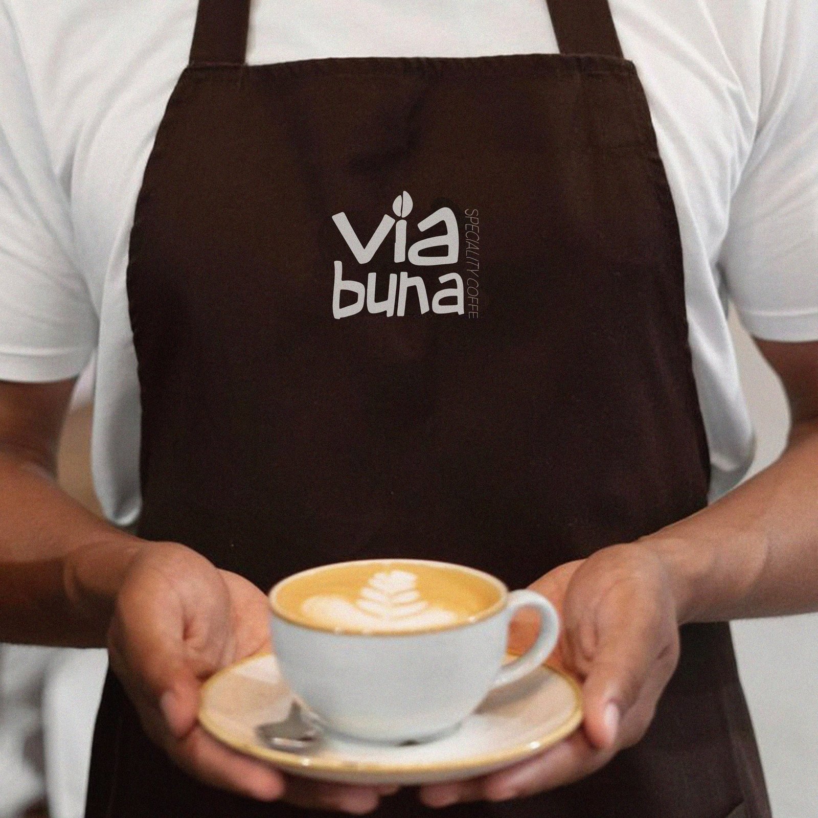
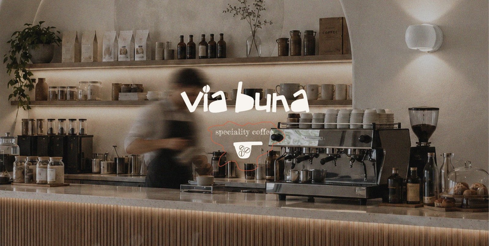
The "via buna" wordmark leans on loose, hand-drawn strokes — playful without losing legibility — with a small scoop-and-beans icon standing in for the dot on the "i," paired with a badge-style lockup that carries the tagline for use across packaging and the storefront.
 Primary Wordmark
 Icon Mark
 The Seal
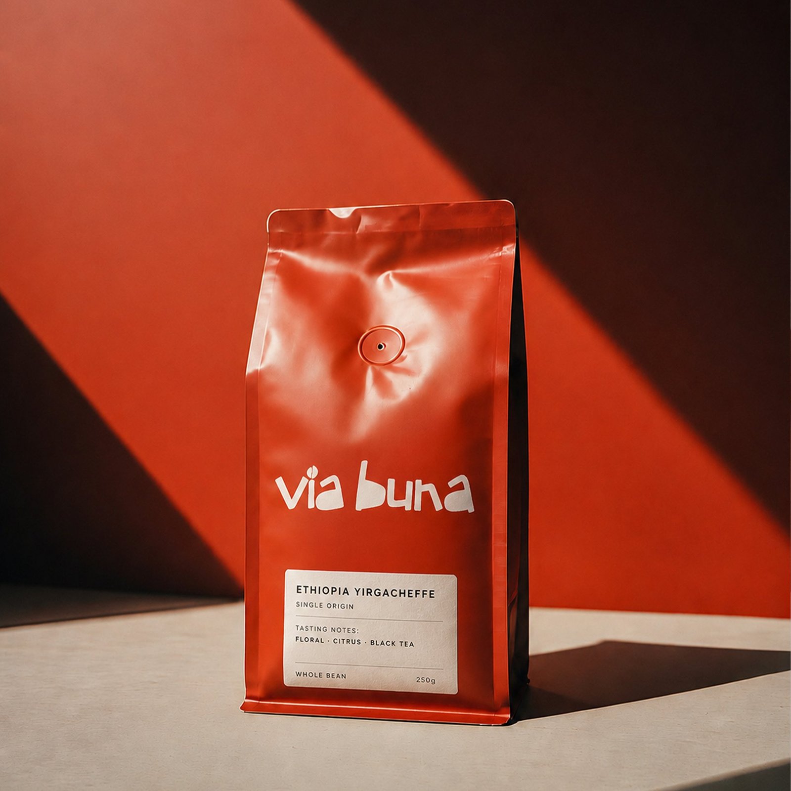
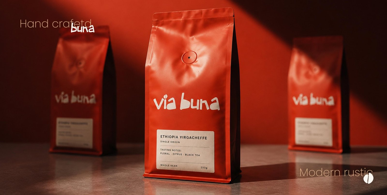
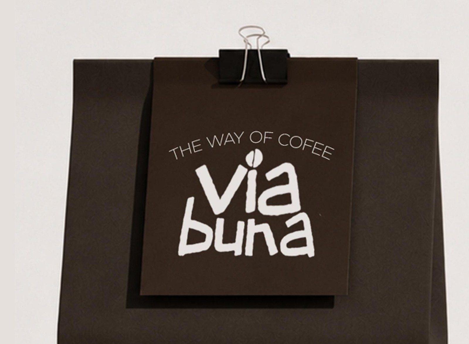
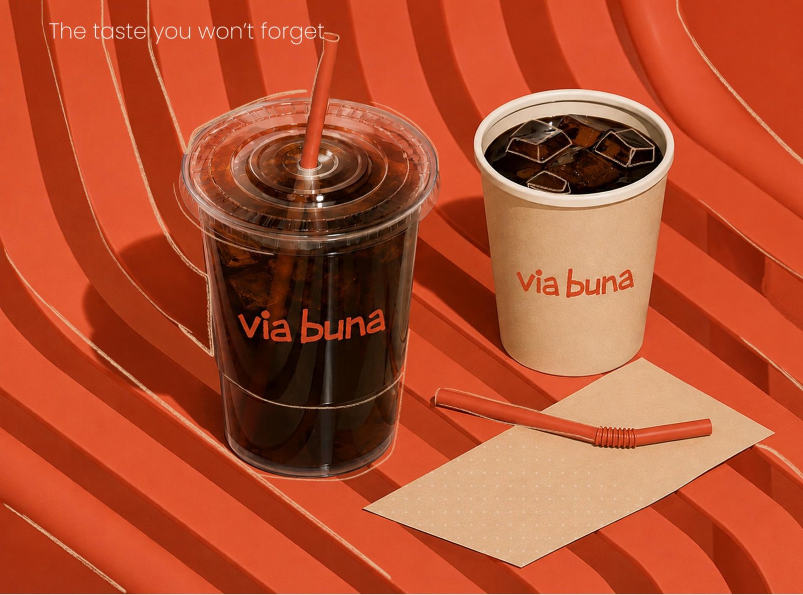
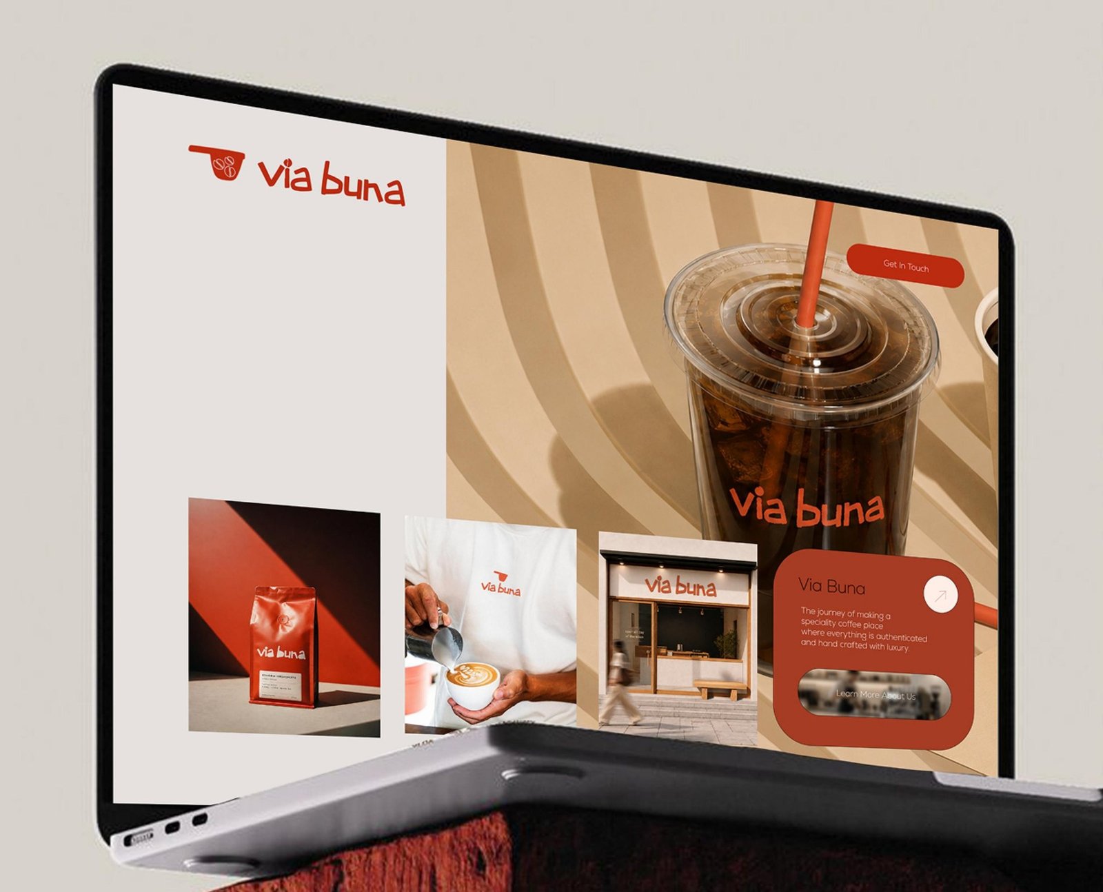
Packaging needed to work equally hard behind the counter and on a retail shelf — a foil bean bag in the brand's own rust orange with a kraft-toned tasting label, a plain kraft retail bag with a hand-tied hang tag, and to-go cups built for the iced drinks that make up half the menu.
Product photography, generous whitespace, and the rust-and-cream palette carried straight from packaging into the UI — a homepage that reads more like a café menu board than a checkout flow, with the storefront and the roast always close by.
We take on a limited number of branding and web projects each quarter — let's talk about yours.