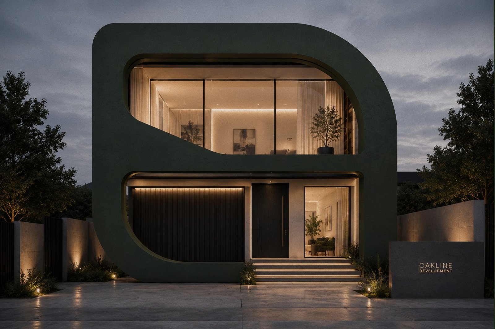
Case Study
Oakline
Logo, brand identity, and website design for a premium real estate development group.
Logo, brand identity, and website design for a premium real estate development group.
Oakline Development Group builds thoughtfully designed residential communities, custom homes, and mixed-use developments across the United States. The brand needed to feel as considered as the architecture itself — trustworthy enough for a buyer signing a contract, distinctive enough to stand apart from every other developer's crest-and-serif logo.
The mark combines the letter "O" with an oak leaf and architectural structure — clean geometric lines for stability and craftsmanship, an organic leaf silhouette for nature, growth, and the lasting value behind every Oakline development.
 Primary Wordmark
 Icon Mark
 Icon Mark, Reversed
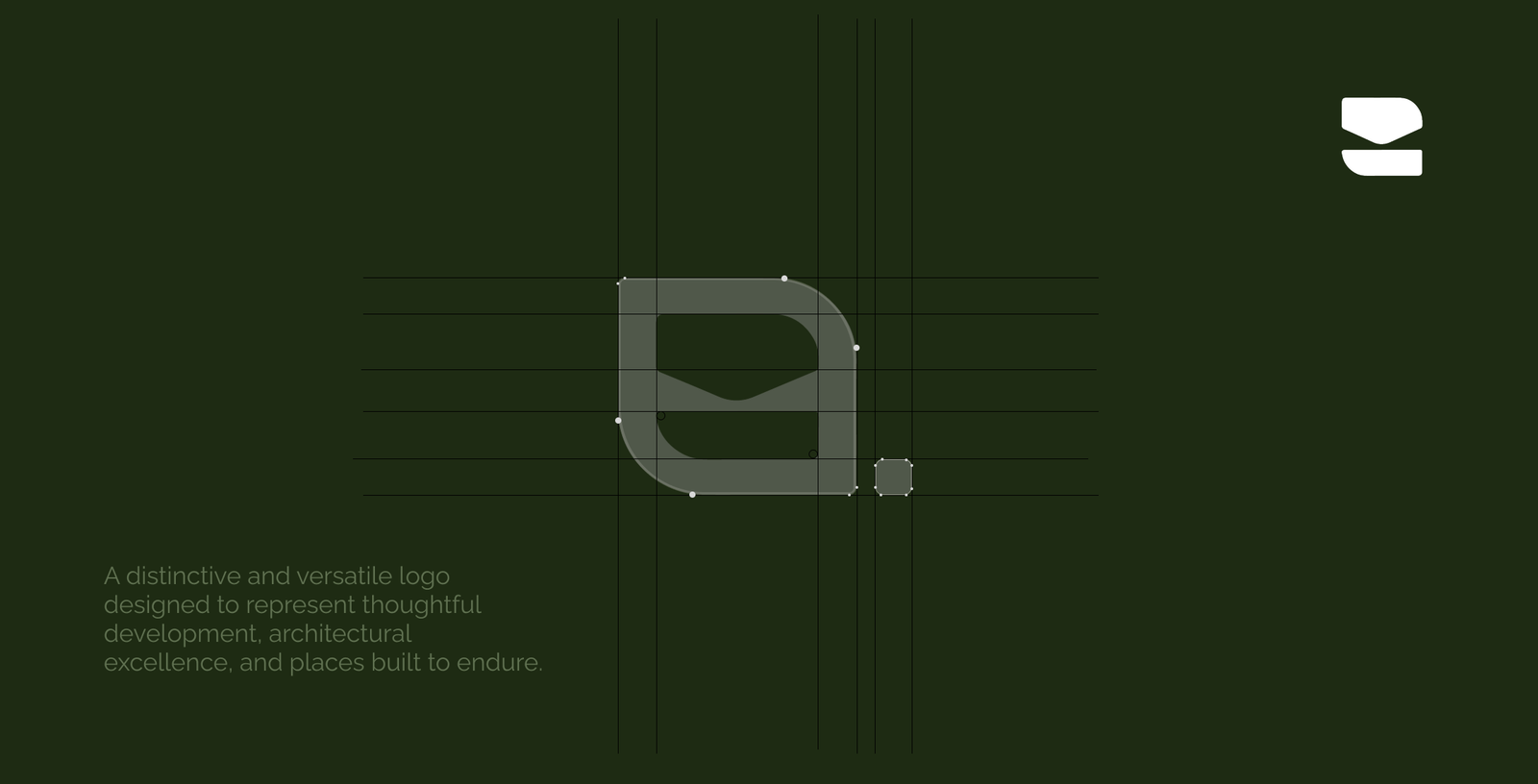
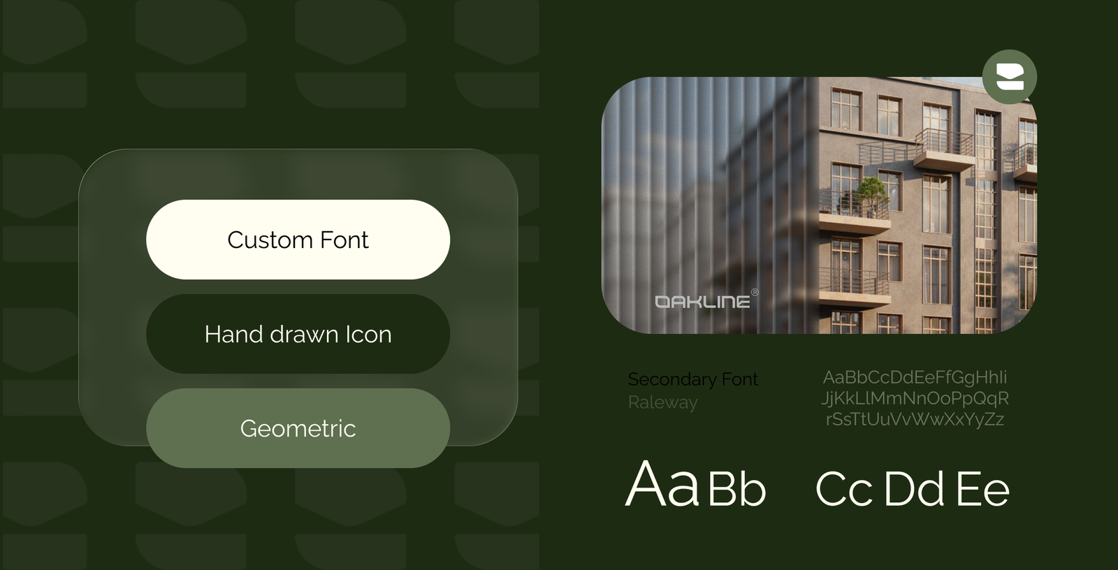
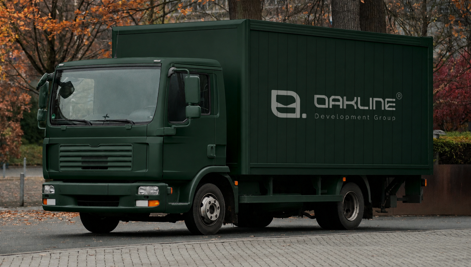
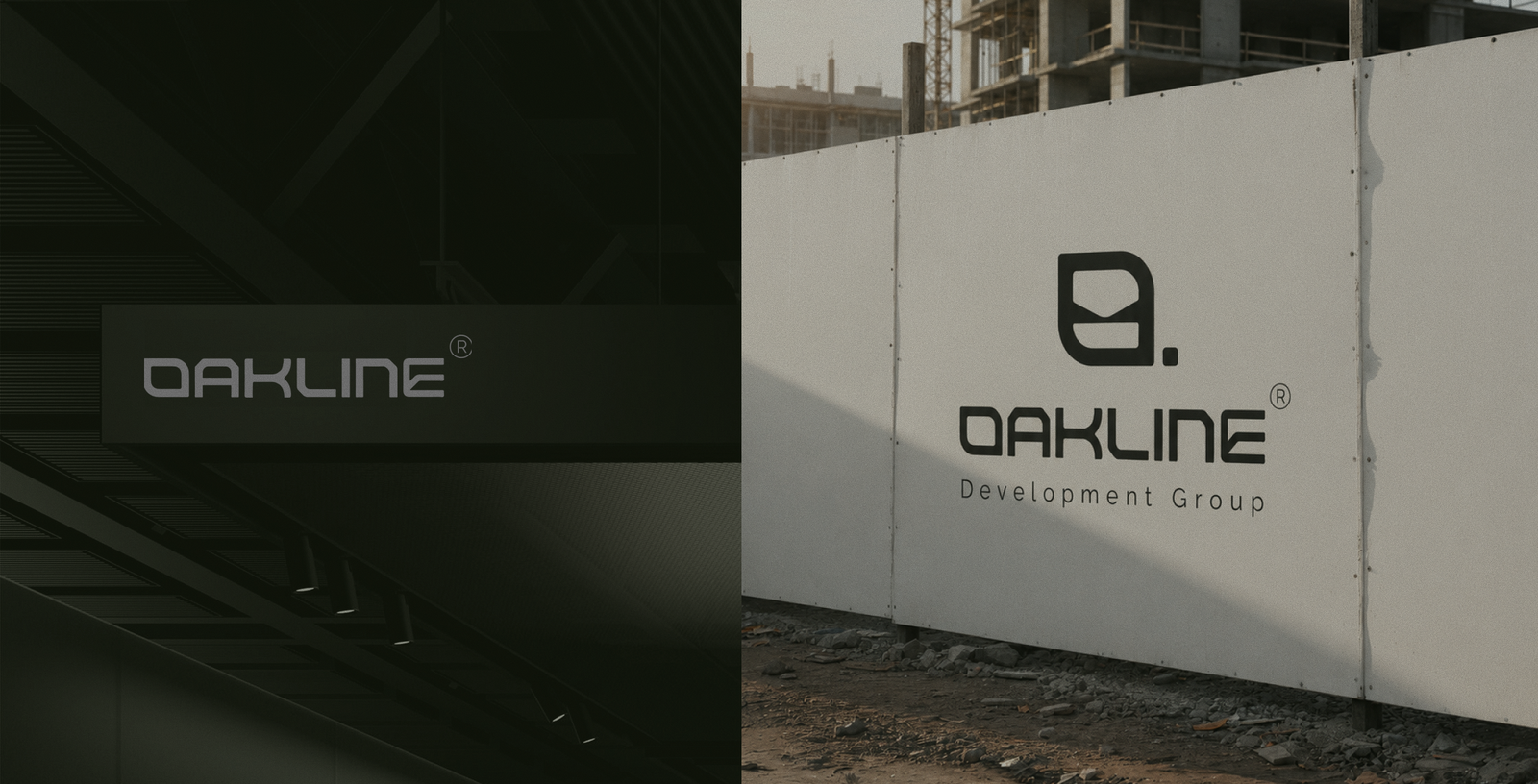
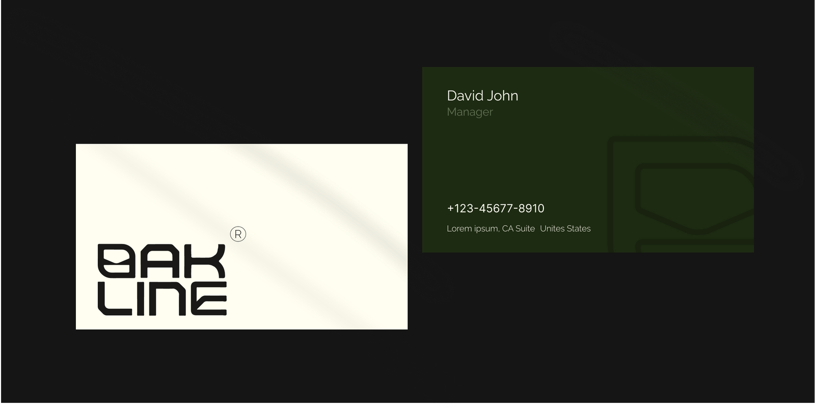
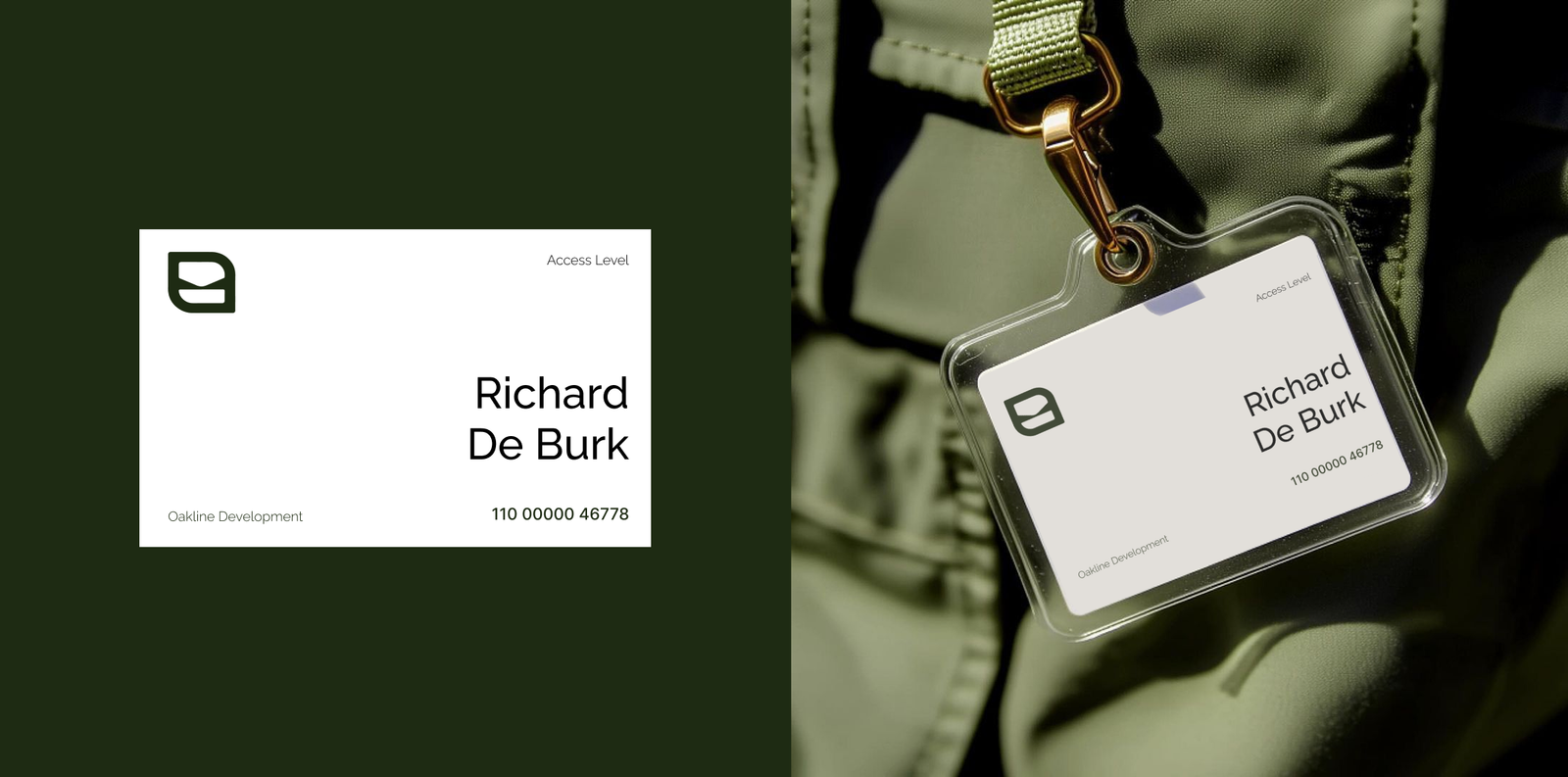
The mark needed to hold up printed at billboard scale and stamped small on an ID badge — consistent proportions and consistent green, whether it's wrapped on a fleet truck, staked outside a construction site, or printed on a business card.
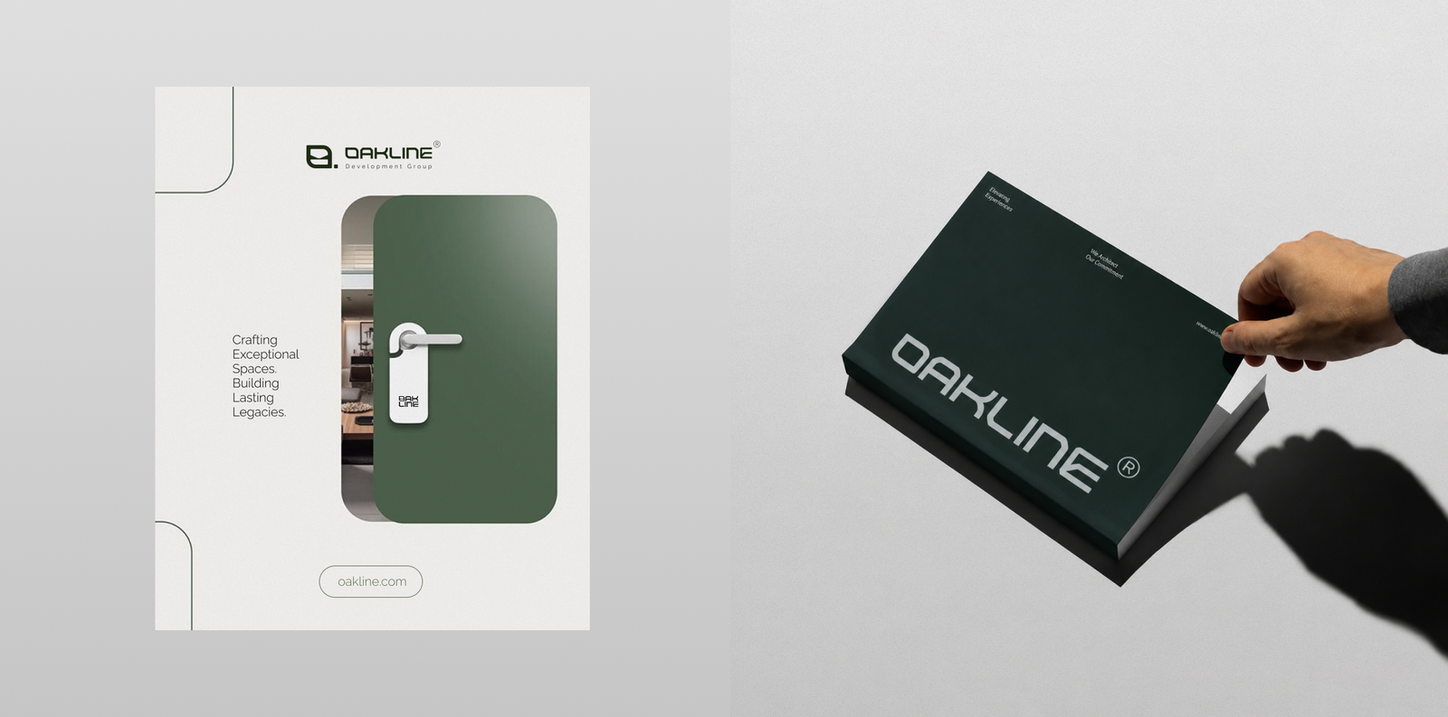
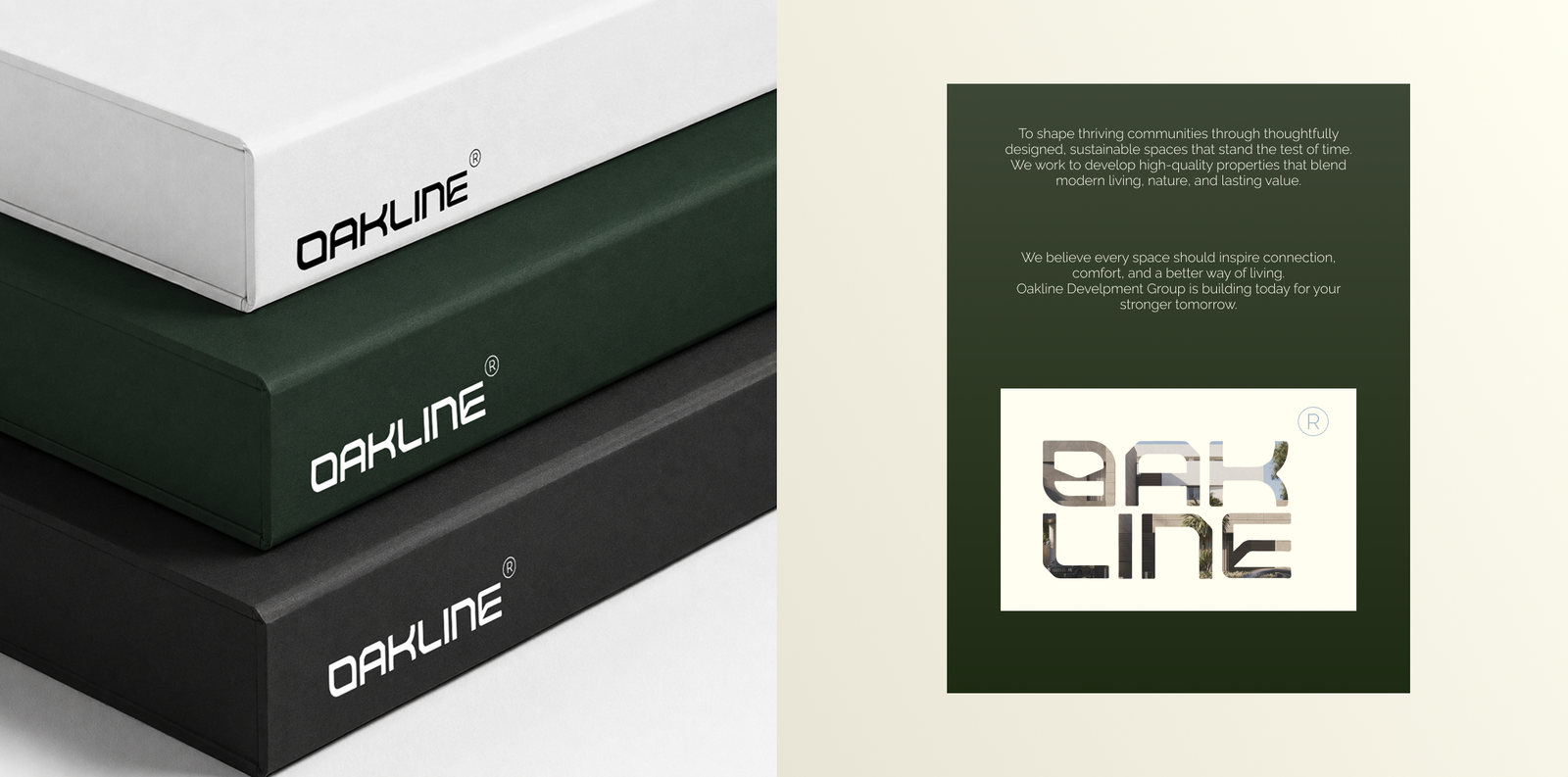
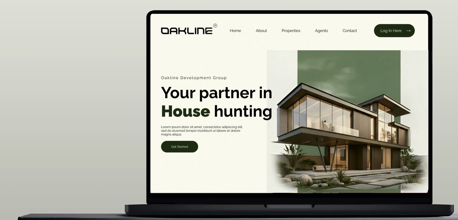
Property photography, generous whitespace, and the forest-and-ivory palette carried straight from print into the UI — a site built to help a buyer picture themselves in the space, not just browse listings.
We take on a limited number of branding and web projects each quarter — let's talk about yours.