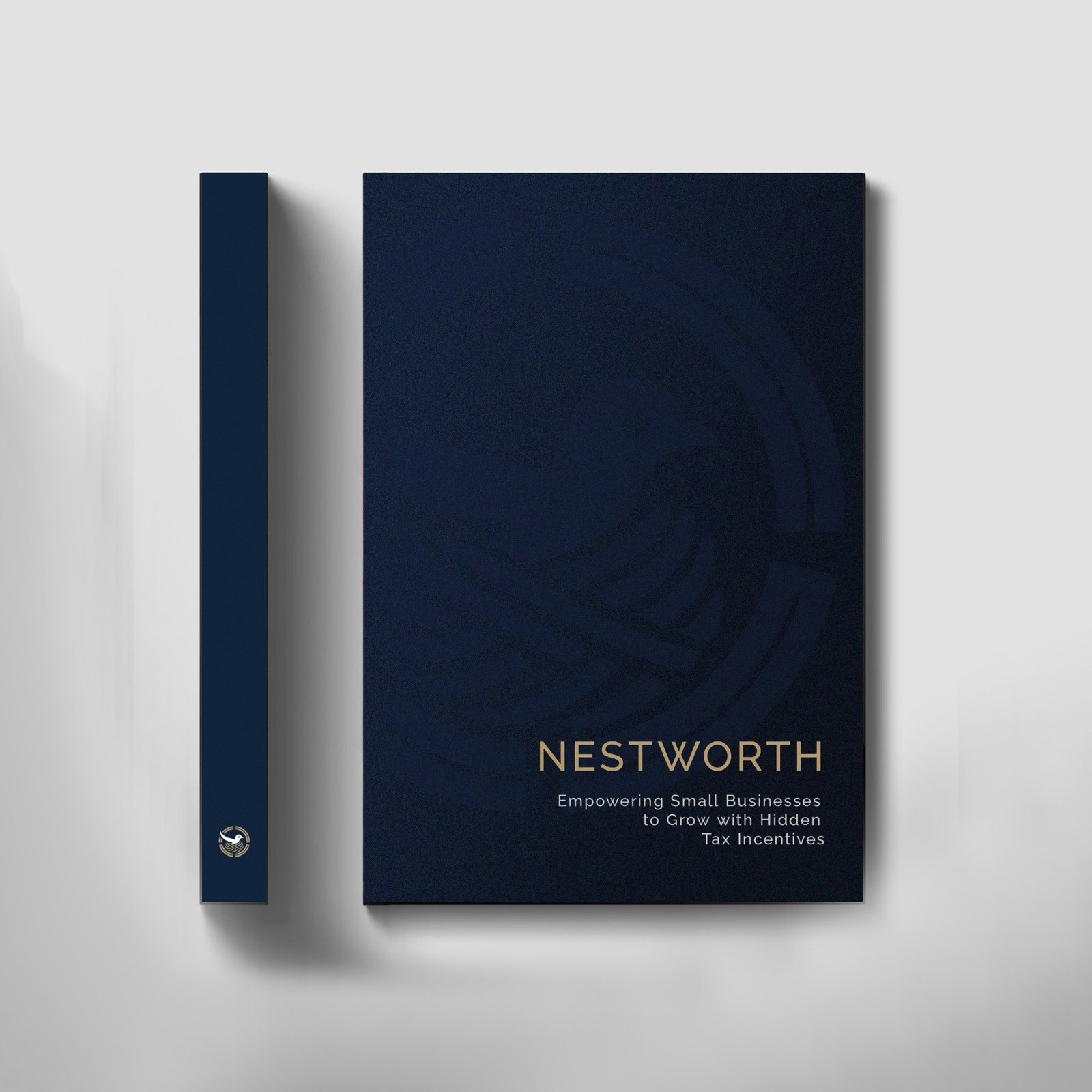
Case Study
NestWorth
Brand identity and website for a small business tax incentive platform.
Brand identity and website for a small business tax incentive platform.
Too often, small and mid-sized businesses miss out on valuable federal and state credits simply because they're hard to find or too complex to claim. NestWorth was founded to change that.
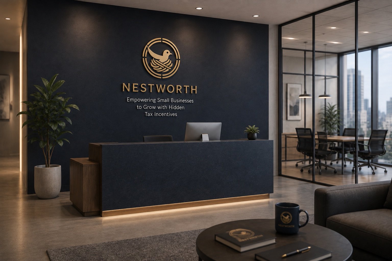
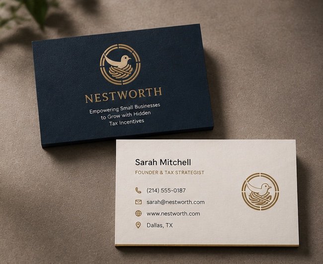
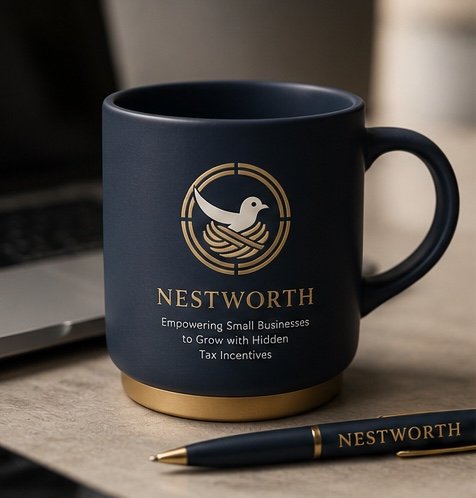
The mark pairs a bird returning to its nest with a compass-like ring — one half signaling security and return, the other guidance and direction — set against a navy-and-gold palette built for trust.
The mark and palette hold up off-screen, too — welcoming clients in the lobby, on the cards handed across a table, and in the small everyday objects that keep the brand present.
The site trades the navy of the brand mark for a warm, paper-toned cream — a small shift that keeps the tone approachable once someone's actually reading. Real photography, plain-spoken copy about the process, and a single clear next step: start the 20-minute assessment.
We take on a limited number of branding and web projects each quarter — let's talk about yours.