
Case Study
Lentz Advisors
Brand identity for a wealth management firm serving high-net-worth individuals, built on a mark that reads as two letters at once.
Brand identity for a wealth management firm serving high-net-worth individuals, built on a mark that reads as two letters at once.
Lentz Advisors is an established wealth management firm operating in the finance industry, serving high-net-worth individuals with tailored financial advice. Every other firm in the space defaults to the same tired vocabulary of navy suits and stock-photo handshakes — we built Lentz a mark and system precise enough to earn trust at a glance, without ever tipping into the generic.
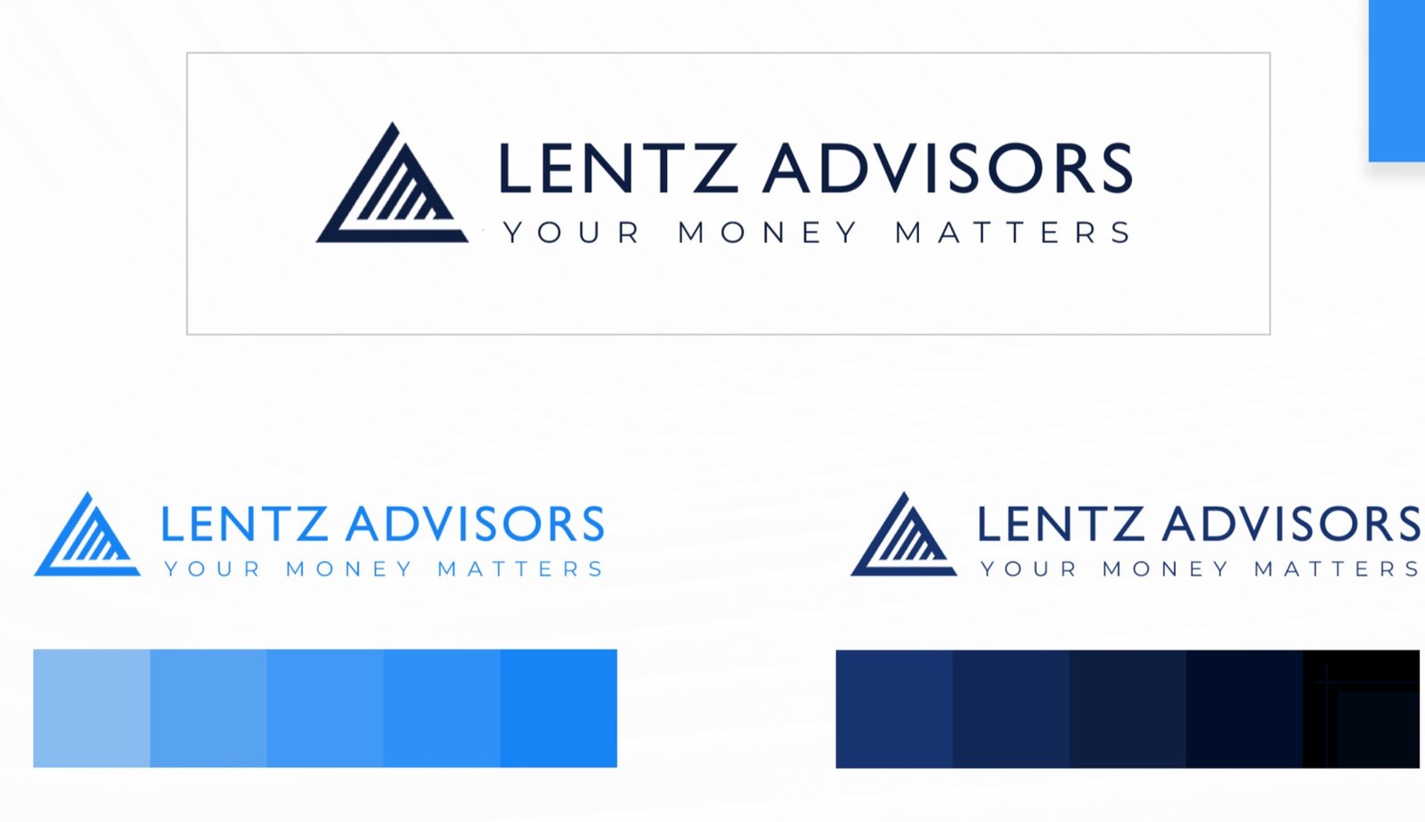
Rather than combining an L and an A as separate glyphs, the mark was built so both letters live in the same triangle — the outline reads as A, the negative space reads as L.
A monogram mark scales down to a favicon or an app icon without losing meaning — important for an advisory brand that lives as much in a client portal as it does on a letterhead.
The triangle reads as ascent and stability at once — a visual shorthand that fits a wealth manager without leaning on a literal arrow-up or coin icon.
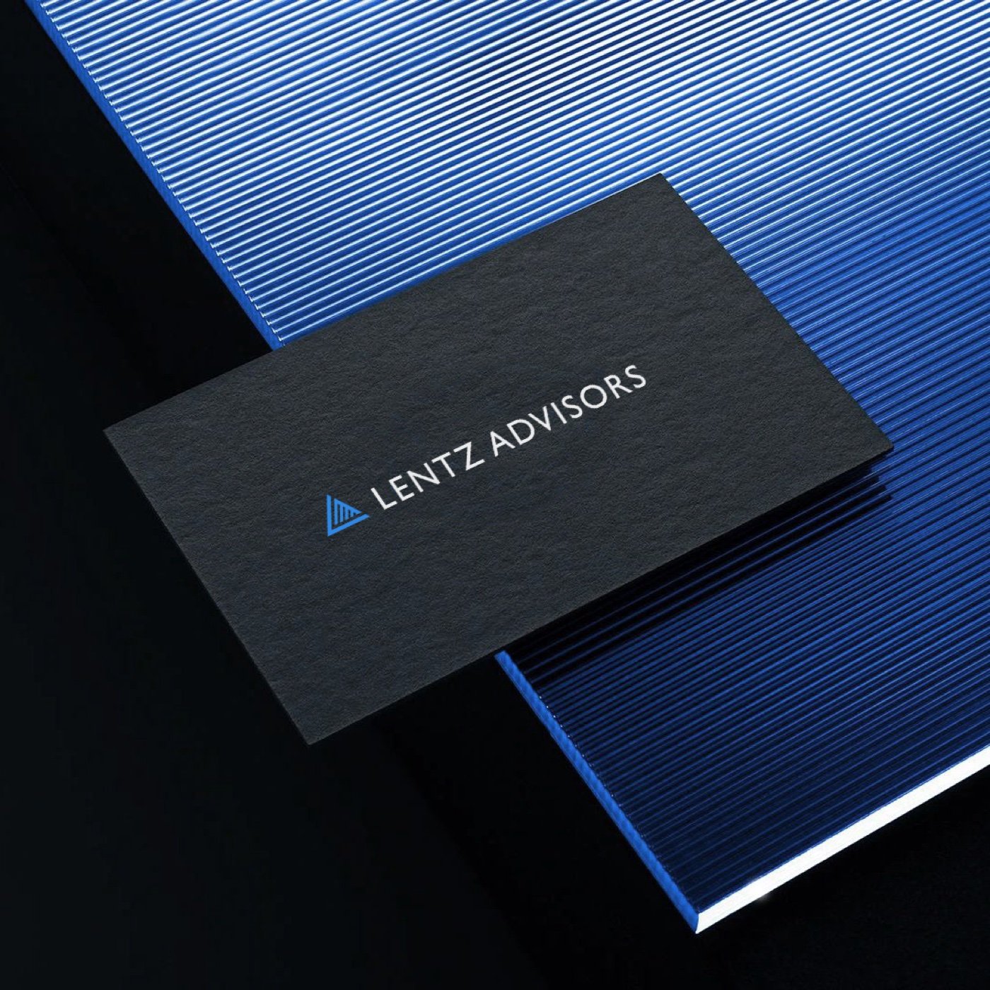
The primary lockup pairs the triangle mark with a clean, wide-set wordmark — enough presence for a homepage hero, quiet enough for a footer.



We take on a limited number of branding and web projects each quarter — let's talk about yours.