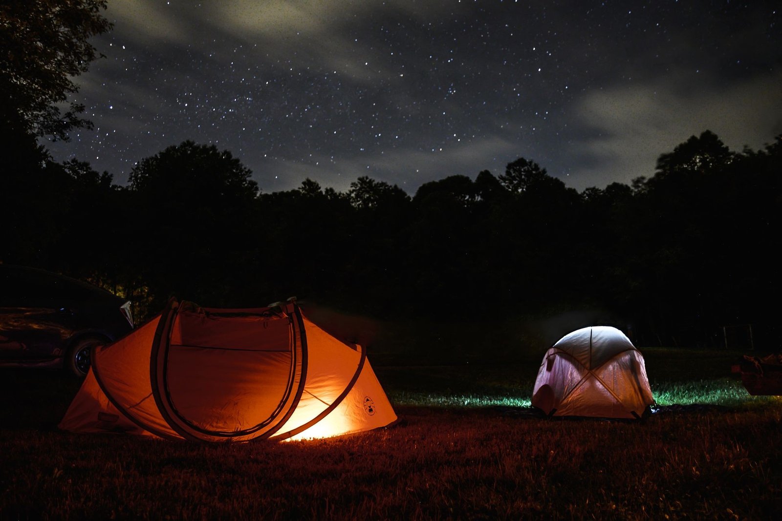
Tents lit up at night among the CoBeAc pines
Case Study

CoBeAc

Branding and web design for a camp and retreat center.

ClientCoBeAc
IndustryCamp & Retreat Ministry
ServicesBranding, Website Design, Development
Year2026
The Brief

Come. Believe. Accept.

Started in 1959 by a group of Independent Baptist churches in Michigan, CoBeAc has served thousands of people across the Great Lakes region for over 60 years — the three words above simple enough for a first-time camper's parent, sturdy enough to carry six decades of ministry.
IndustryCamp & retreat ministry
DeliverablesLogo & brand identity, website design & development
Primary colorForest Green — #1A421D
Summer Camp Ministry Year-Round Retreats Father & Son Getaways Family Camps
Color

Forest green, warmed up with campfire orange.

Forest Green #1A421D — Primary
Deep Pine#102B12
Campfire Orange#E8934A
Warm Cream#F5F3EE
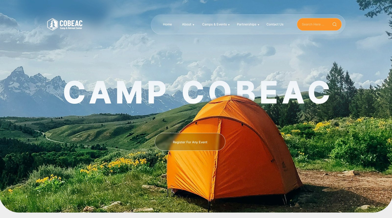
The CoBeAc website hero, Camp CoBeAc over an orange tent in a mountain meadow
The Website

A full year of camp, on one homepage.

Registration, a live events calendar, camp news, and a merch store all had to live on one page without feeling cluttered — so the site leans on generous cream cards and a warm sans-serif to keep sixty years of programming easy to scan.
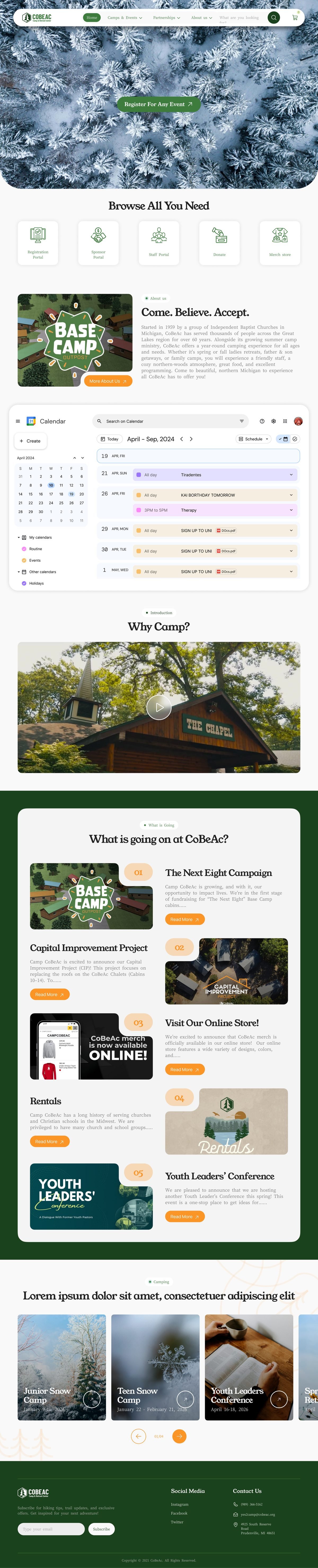
The full CoBeAc homepage design, scrolling from the hero through events and camp news
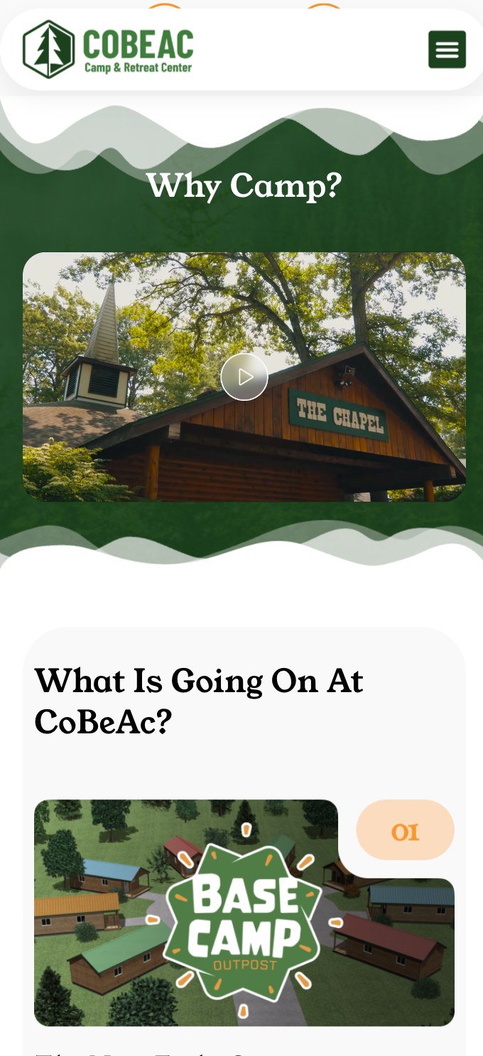
The CoBeAc website on mobile, showing the Why Camp and What Is Going On sections

Like what you see?

We take on a limited number of branding and web projects each quarter — let's talk about yours.

Start a project See more work