The Beam wordmark lit up in gold inside the dental studio
Case Study

Beam

Brand identity and website design for a dental studio that doesn't feel clinical.

ClientBeam
IndustryDental & Oral Care
ServicesBranding, Website Design, Development
Year2026
The Brief

Dentistry, minus the dread.

Beam wanted to shed the beige-and-blue clinical look most dental practices default to and build something that felt closer to a boutique studio — warm tones, natural light, a mark patients would actually remember between visits.
IndustryDental & oral care
DeliverablesLogo & brand identity, website design & development
Primary colorDeep Maroon — #4E2C2C
General Dentistry Cosmetic & Whitening Family Care Same-Day Visits
Color

Maroon, warmed up with brushed gold.

Deep Maroon #4E2C2C — Primary
Espresso#2C1918
Brushed Gold#E8B368
Warm Cream#F7F1E6
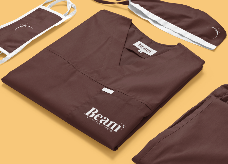
Beam branded scrubs, showing the logotype applied to studio apparel
The Website

A homepage that feels like the studio, not the office.

The Beam wordmark on a deep maroon card

Like what you see?

We take on a limited number of branding and web projects each quarter — let's talk about yours.

Start a project See more work