Case Study
Aurelia Botanics
Logo, brand identity, packaging, UI/UX, and website design for a clean-ingredient skincare line.
Logo, brand identity, packaging, UI/UX, and website design for a clean-ingredient skincare line.
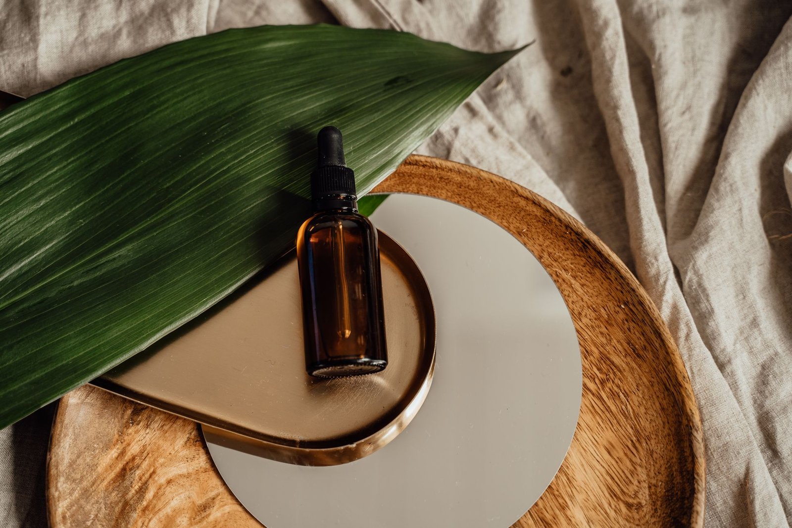
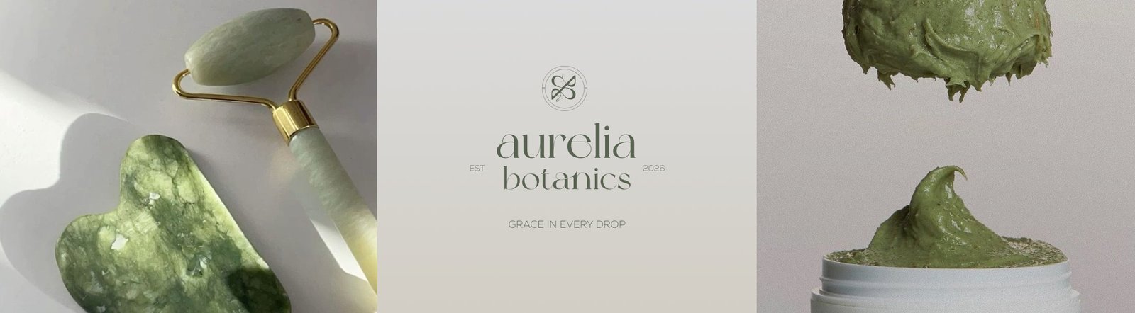
Aurelia Botanics makes small-batch serums and creams built around a short list of plant-based actives — the brand needed to feel as unprocessed as the formulas, without sliding into generic "clean beauty" cliché.
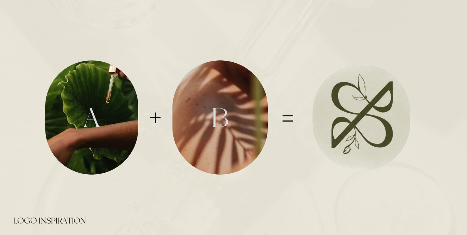
The letterforms lean on a soft, hand-finished serif so nothing about the mark reads mass-produced — paired with a standalone icon and a round seal for the spaces too small for the full wordmark.
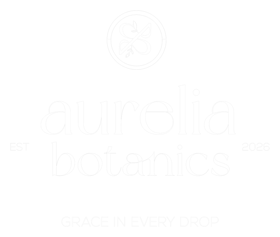 Primary Wordmark
 Icon Mark
 The Seal

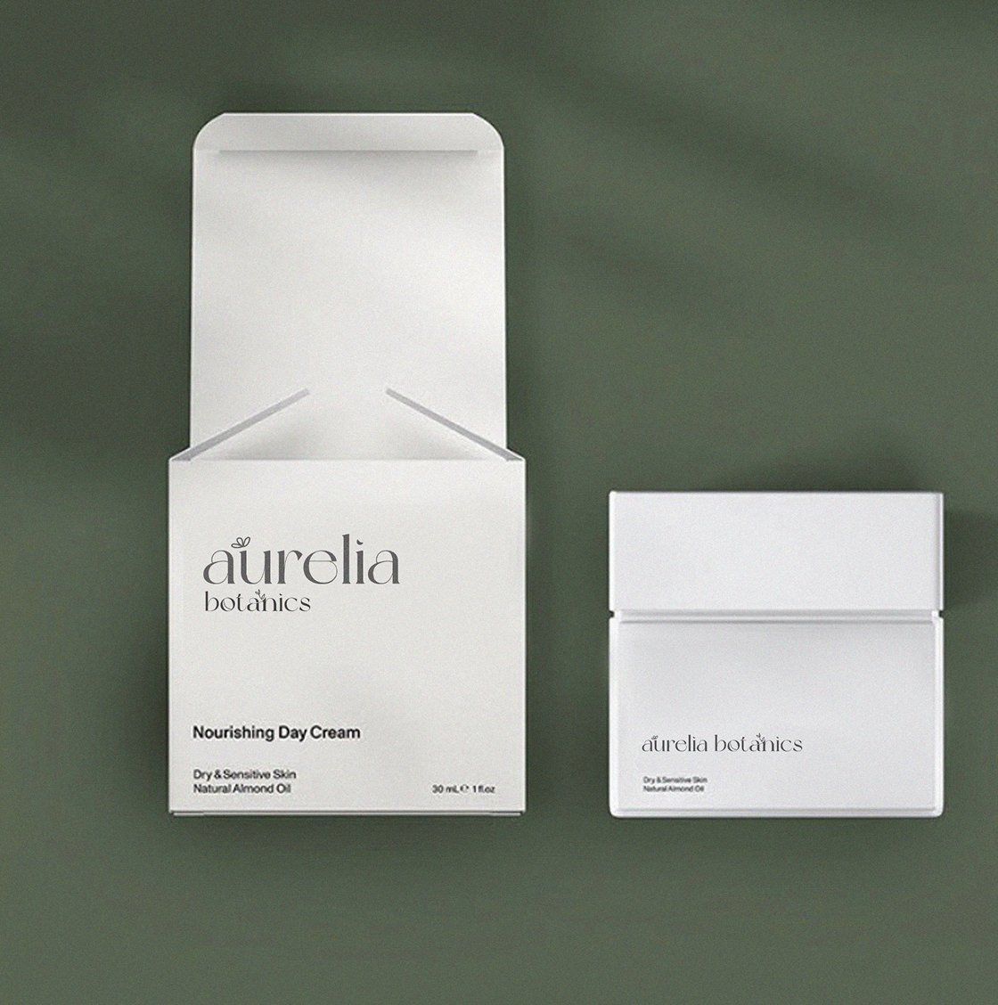
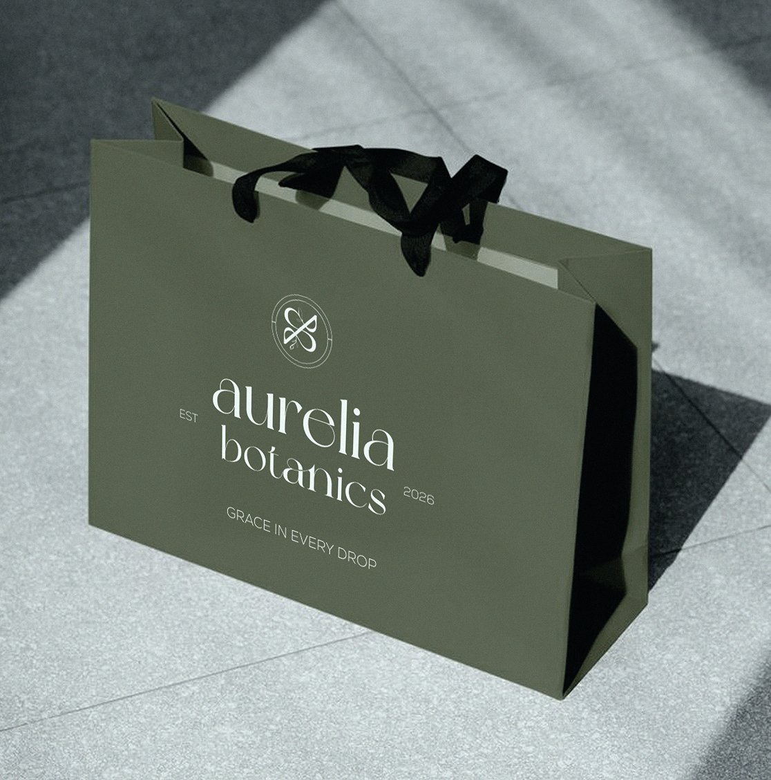
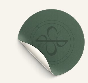
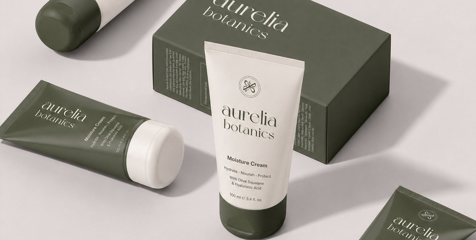
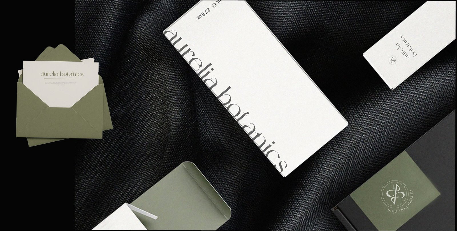
Packaging needed to survive a bathroom shelf and a gift table equally well — glass jars and bottles in the brand's own green, a plain kraft bag for retail pickup, and a round foil seal that doubles as a tamper-evident sticker.
Product photography, generous whitespace, and the fern-and-ivory palette carried straight from packaging into the UI — clean product grids and copy that reads more like a skincare routine than a checkout flow.
We take on a limited number of branding and web projects each quarter — let's talk about yours.